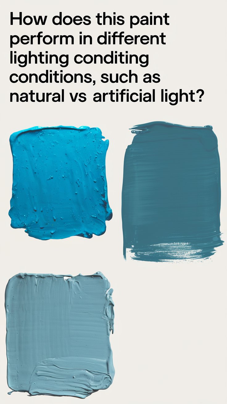
Mindful Gray by Sherwin-Williams is a versatile, sophisticated neutral that adapts beautifully to different lighting conditions. This warm gray has subtle undertones of beige and greige, making it a go-to choice for modern interiors. However, lighting plays a crucial role in how this color appears in different rooms. Whether natural daylight, warm incandescent bulbs, or cool LED lighting, each setting influences the perception of Mindful Gray.
The Impact of Lighting on Mindful Gray

1. Natural Light
Rooms with ample natural light allow Mindful Gray to show its true greige character. North-facing rooms may make it appear slightly cooler, while south-facing rooms enhance its warmth.
2. Artificial Lighting
Warm artificial lighting, such as incandescent or soft white LED bulbs, brings out its beige undertones. Cooler lighting, like daylight LED bulbs, can make it lean toward a cooler gray.
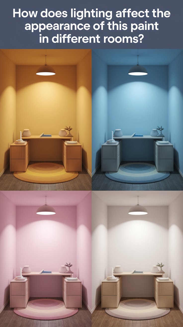
3. Shadows and Depth
Rooms with multiple angles and shadows may cause variations in color perception. Dark corners may make Mindful Gray appear richer, while direct light makes it look lighter.
4. Reflection from Other Surfaces
Furniture, flooring, and décor can reflect hues onto the walls, subtly altering how the color is perceived. Lighter surfaces enhance its brightness, while darker elements deepen its tone.
5. Room Size and Ambiance
In smaller spaces, Mindful Gray provides a cozy, inviting atmosphere, whereas in larger, well-lit rooms, it appears more open and airy.
5 Tips to Match Mindful Gray with Other Colors

1. Pair with Crisp White Trim
To highlight the depth of Mindful Gray, use crisp whites like Sherwin-Williams Extra White (SW 7006) for trim and molding.
2. Introduce Warm Wood Tones
Wood accents, such as oak or walnut, bring warmth and contrast, enhancing the neutral charm of Mindful Gray.
3. Add Soft Pastel Accents
Incorporate pastel shades like blush pink, muted blue, or sage green for a subtle and sophisticated look.
4. Use Black or Charcoal for Drama
For a modern contrast, pair Mindful Gray with black fixtures, dark furniture, or charcoal décor.
5. Blend with Earthy Neutrals
Complementing Mindful Gray with beige, taupe, or creamy neutrals creates a cohesive, layered design.
5 Hue Matching Ideas for Mindful Gray

1. Soft Blue for a Serene Feel
Light blues like Sherwin-Williams Sea Salt add a calm and coastal-inspired ambiance.
2. Sage Green for an Earthy Touch
Pairing it with soft greens like Sherwin-Williams Clary Sage creates a refreshing, nature-inspired space.
3. Deep Navy for Contrast
A deep blue like Sherwin-Williams Naval provides a bold and sophisticated contrast.
4. Warm Beige for a Cozy Aesthetic
Pairing with shades like Benjamin Moore’s Revere Pewter enhances warmth in the space.
5. Muted Lavender for Elegance
Soft purples or lavenders introduce a hint of femininity and sophistication to a room.
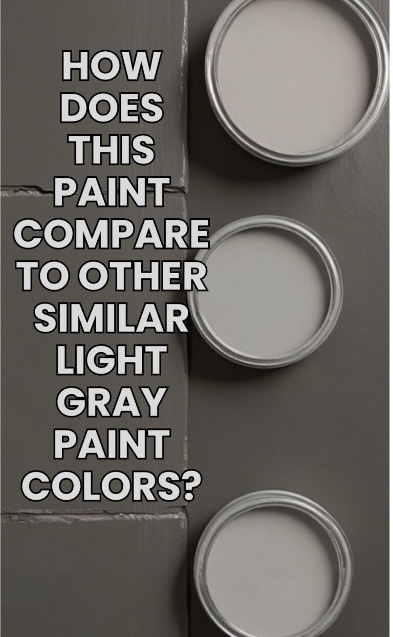
5 Alternative Colors from Sherwin-Williams and Benjamin Moore

1. Repose Gray (Sherwin-Williams)
A slightly lighter and cooler alternative, perfect for well-lit spaces.
2. Agreeable Gray (Sherwin-Williams)
Leaning more toward a greige tone, it’s an excellent choice for warm and inviting interiors.
3. Edgecomb Gray (Benjamin Moore)
A warm greige with subtle beige undertones, ideal for traditional and modern homes.
4. Classic Gray (Benjamin Moore)
A soft, airy gray that provides a light and elegant touch.
5. Accessible Beige (Sherwin-Williams)
For those preferring a warmer neutral, this beige-gray blend is an excellent alternative.
Other Rooms to Use Mindful Gray

Living Room
Mindful Gray offers a serene and welcoming backdrop in living rooms. Pair it with plush furnishings and layered textures for an inviting space.
Bedroom
This color creates a relaxing atmosphere in bedrooms, working well with both modern and traditional décor.
Kitchen
As a kitchen wall or cabinet color, Mindful Gray blends seamlessly with white countertops and warm wooden accents.
Bathroom
In bathrooms, Mindful Gray pairs beautifully with white tiles and brushed nickel or black fixtures for a spa-like effect.
Home Office
For home offices, Mindful Gray provides a professional and balanced environment, fostering focus and creativity.
Conclusion

Mindful Gray is a timeless and adaptable paint color that works beautifully in different lighting conditions. Its greige tones make it an excellent choice for various rooms, from living spaces to kitchens and bedrooms. By understanding how lighting affects its appearance and pairing it with complementary colors, you can create a stylish and cohesive home interior. Whether you prefer a warm, inviting space or a sleek, modern look, Mindful Gray remains a reliable and sophisticated choice for any design style.